Software: Adobe Indesign, Adobe Photoshop, Adobe Illustrator
Deliverables: Visual Branding, Logo Design, Marketing
Branding concept for a conceptual nonprofit organization, New Landing, that supports new immigrants to Canada. The focus for New Landing was to develop a brand identity reflecting family, unity, hope, and new beginnings, incorporating red and white in the logo to represent Canada. Specific fonts and sizes were provided for the website, with logo variations for different print formats.
Client Brief:
Company Background:
New Landing is a nonprofit organization focused on supporting new immigrants through integration and community-building. While they had selected specific colours and fonts for their brand, they lacked a formal logo. The brand’s mission to empower and connect immigrants was the cornerstone of the logo’s design concept.
Challenge:
The challenge was to craft a meaningful logo that embodies the organization's core values of support, unity, and empowerment, ensuring it was adaptable across various platforms and media. The design went through multiple iterations before arriving at the final version.
Conceptual Development Process:
Multiple prototypes for the New Landing logo, staying true to the colours and fonts requested by the client. The logo’s concept centered around conveying a welcoming, inclusive atmosphere for newcomers. One concept featured two figures beneath the sun, symbolizing unity, support and a bright future for immigrants, which would become the final design.
To refine the brand identity, several mood boards and sketches were created, aiming to strike a balance between warmth and professionalism while effectively communicating the organization’s message of empowerment and inclusion.
Logo Concepts:
The designer began by experimenting with visual elements that would symbolize connection and welcome. Various iterations were explored, incorporating symbols like figures and the sun to communicate unity, hope and safety for newcomers.
Colour Palette:
A colour palette was chosen based on the client's preferences, aiming for warm, red tones that felt approachable and reassuring. These colours were designed to be versatile across digital and print applications, including social media and marketing materials.
Various prototypes for the logo, keeping the colours and fonts the client requested.
The final design that was approved.
Brand Guidelines:
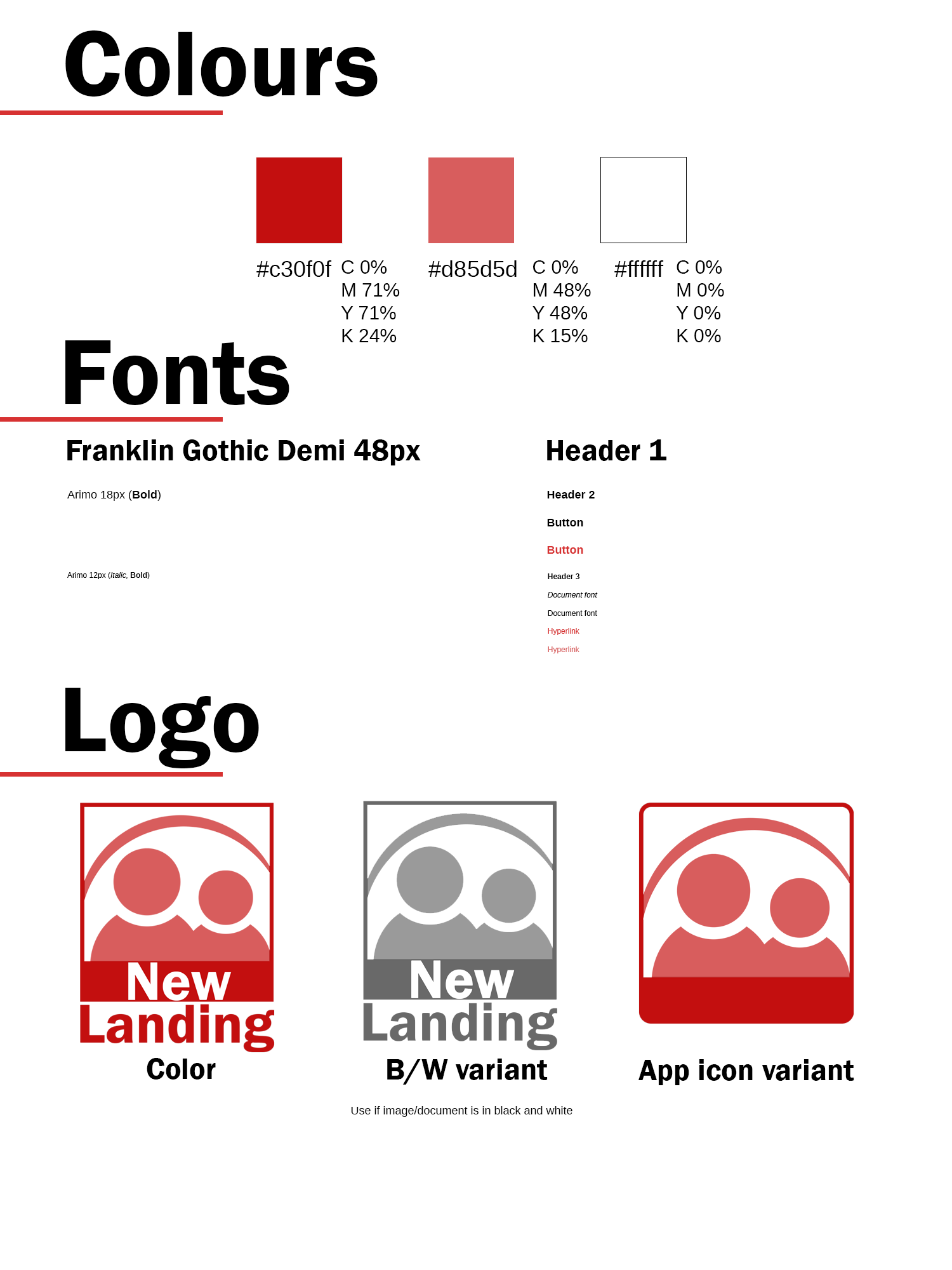
A detailed set of brand guidelines was crafted to ensure consistent and cohesive representation across all brand materials. These guidelines outlined the proper usage of the logo, typography, and colour scheme for both digital and print media.
Logo Usage: Clear instructions were provided on logo placement and how to maintain its integrity across different backgrounds and media formats, ensuring it remained visible and impactful in various applications.
Typography: The chosen typography was selected to complement the brand’s identity while maintaining readability and coherence across all touchpoints, from digital interfaces to printed materials.
Colour Palette: Specific colour codes were established to ensure colour consistency across platforms. The red and white tones were emphasized, creating a cohesive look across all brand assets.
Style guide showcasing what fonts, colours and icons to use for the organization.


