Software: Adobe Indesign, Adobe Photoshop, Adobe Illustrator
Deliverables: Website Design, Logo Design, UI/UX Design
Conceptual design and layout creation for InToIt’s social media platform. The main objective was to create a user-centric layout that seamlessly integrated key features such as real-time feed updates, comment functionality, and the ability to like and repost content. Recognizing the diverse range of devices users would access the platform from, the design process included the creation of responsive layouts optimized for mobile, tablet, and desktop views. Each layout was carefully crafted to ensure the site’s functionality and visual appeal remained consistent across different screen sizes. The iterative design approach prioritized user experience, ensuring that the home page not only displayed well on all devices but also offered an engaging, intuitive interface for users to interact with content on InToIt. The result was a cohesive, flexible design that met the needs of a diverse user base while maintaining the platform's core functionality.
Company Background:
InToIt is developing a social media platform designed to empower users with greater control over their online presence. The platform focuses on customizable design options, allowing users to personalize their experience while sharing various forms of content, including posts, images, and videos.
Challenge:
The concept required a visually engaging and intuitive platform that would appeal to users aged 18 to 40—creatives, entrepreneurs, and individuals eager to express themselves. The default design featured a mint green and white colour scheme, providing a fresh, modern aesthetic for new users while offering customization options such as background colours, fonts, and button placement.
Beyond content sharing, the platform needed to support a built-in marketplace, enabling users to showcase and sell their work, from digital art and music to books and physical products. The challenge was to create a flexible yet cohesive user experience that encouraged creativity while maintaining an intuitive, user-friendly interface.
Conceptual Development:
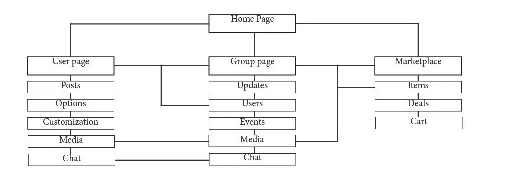
The development process began with the creation of a site map, outlining the platform’s core functionalities and user journey. Once the structure was established, rough mockups were designed to visualize key pages, particularly the home page, ensuring an intuitive layout and logical placement of navigation links. These mockups served as an initial framework for defining the user interface and content flow.
To refine the platform’s visual identity and usability, mood boards and sketches were developed to explore different design directions. The focus was on balancing creative expression with functionality, ensuring a seamless experience for the target audience.
User Interface & Customization: The default design featured a mint green and white colour scheme to create a fresh, modern aesthetic. Customization options were incorporated, allowing users to modify background colours, fonts, and layout preferences.
Visual Hierarchy & Layout: The mockups prioritized clear navigation and accessibility, ensuring that key features such as content sharing and the marketplace were easily discoverable.
Refinement & Iteration: Feedback and usability considerations guided the refinement of the mockups, enhancing clarity, responsiveness, and consistency across different devices.
This conceptual phase established a strong foundation for a flexible and visually engaging platform, enabling users to personalize their experience while maintaining a cohesive and structured interface.
Mockup of the site’s user page.
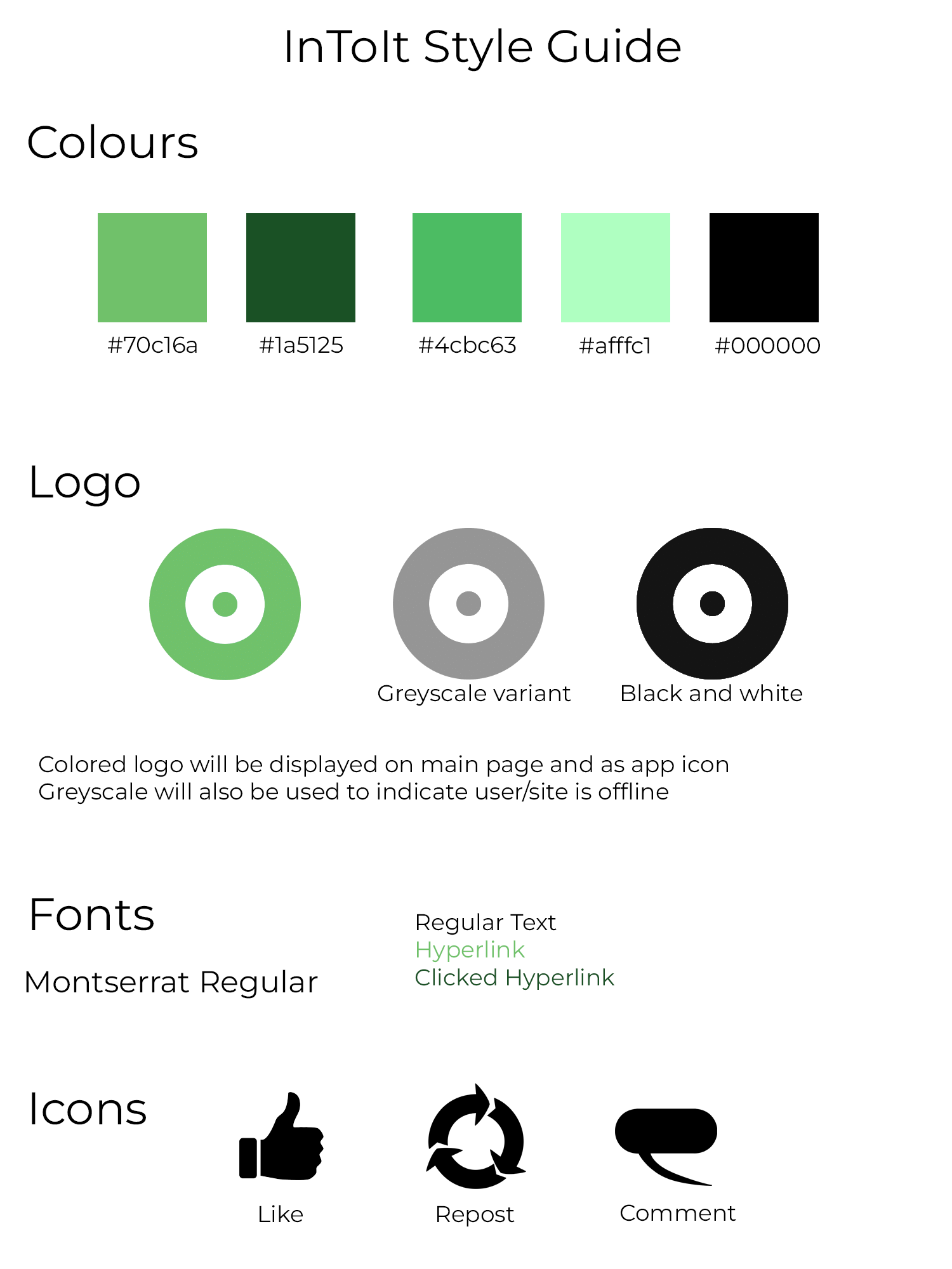
Brand Guidelines:
A comprehensive set of brand guidelines was developed to ensure consistency across all touch points. These guidelines provided clear specifications for logo usage, typography, and colour application across digital and print media.
Logo Usage: Detailed instructions outlined proper logo placement on various backgrounds, ensuring visibility and brand integrity. Guidelines also specified scaling requirements for different media formats.
Typography: The brand’s typography was carefully selected to maintain readability and cohesion across platforms.
Colour Palette: To maintain visual consistency, specific HEX and CMYK values were established for all brand colours. The primary palette was various shades of mint green, ensuring seamless integration across digital interfaces and printed materials.
Style guide for the website and branding.
Responsive Design & Visual Development:
Following the initial mockup, a more refined version was created, introducing the brand’s colour palette, typography, and iconography. This enhanced mockup served as the foundation for adapting the design across multiple devices, ensuring a seamless user experience on desktops, tablets, and mobile phones.
Social Media Strategy & Visuals:
Recognizing the role of social media in establishing brand identity, a strategic approach was developed to maintain visual consistency while engaging the target audience.
Content Themes: Several content categories were defined to align with the brand’s mission and appeal to users:
Customization Features: Highlighting user personalization options through engaging visuals and tutorials.
Community Spotlights: Showcasing user-generated content, including artwork, music, and other creative projects.
Marketplace Highlights: Featuring products available for sale, reinforcing the platform’s role as both a creative space and a marketplace.
Visual Style: A cohesive aesthetic was established, incorporating clean, modern layouts with the brand’s colour palette. High-quality images, minimalistic design elements, and consistent use of typography ensured brand recognition across all digital platforms.
This strategic approach reinforced the brand’s identity while fostering engagement and interaction within the platform’s community.
The final design, showcasing what the website looks like on desktops, tablets and phones in that order.


